Saturday 27 November 2010

How it works: The Mechanics

From my research of existing iphone games, i began thinking about how my game would work during my character designs. I believe i have come up with the ideal way in which this game would work successfully, by both not taking up much room on the screen, and also to use the full potential of the iPhone/iPad.


This is my full screen of what my game would look like in full swing. As you can see in both the left and right hand corners are two different coloured bars. The green bar is the health indicator, in which depletes in size as you take damage. The other bar is the special weapon's power meter. This fills up  when you land successful punches on your opponent, and once the bar fills you can select the weapon by tapping it with your finger. You can then use your unique weapon to your advantage which will increase your attack power. The icons under the bars, are the images of what weapon you have unlocked once the weapons indicator has filled up, so you are prepared for the power you're about to unleash ;]. Within this certain map the interactive objects are, the cereal box, cereal bowl and spoon, the toaster, toast, power cord, power socket, milk carton and the cupboards. What i mean by interactive is that during combat with your opponent, the environment will get damaged. Also you can use this to your advantage ,for example splitting the milk carton on purpose to make a slippery surface. It's object may or may not aid you in your battles, that's for the player to take risk within in decision making, but it all hypes up to how you want to play the game.

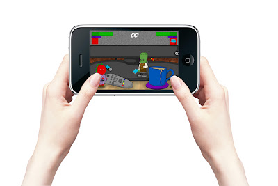
Here is a visual example of a combat scene where both characters have unlocked their weapons. Now for how to move and fight :). Holding the screen shown is one of the ways you can use the tilting mechanism within the iPhone/iPad. To move your characters from left to right, up or down. Simply tilt the screen in which direction you want to go. If you want to perform a jump, jolt the screen upwards which will initiate the jump. For easy movement, you will not need to dramatically tilt your screen to move, it will be quick to respond, so you need not worry about getting frustrated you've tilted the screen 90 degrees and you're still not moving :P


Now for how to interact and fight. Here are the actions you must take in order to make your character react :

Attack :  Swipe finger over your own characters body parts when close to the enemy, different parts trigger different moves. Such as swiping the leg would make your character kick, or swiping the arm would initiate a punch.

Block :  Hold finger down on character

Interact with objects :  Tap object when close to it
Use Weapon :  Tap repeatedly on character to fire or swing.

Weapons.

As one of the key features within my game concept, i decided to make all the characters have their own unique weapons that are unlockable depending on your progression through  a match. For example if you land a lot of hits onto your opponent without getting hit back, you fill a weapons meter in which once it is full you can tap a 'weapon' icon in which selects it. Your weapon will be unique to your character and will aid drastically within battle. Here is 'Bob's" weapon which is a 2x4 piece of wood with nails in the top. I made this his weapon because it is quite primitive and matches his personality. The weapon itself is similar to a club in which cave men used to use, so the relation there links the brain span of both species.


Here is 'Frankie's' weapon, something i like to call the 'Battery Gun'. I chose this concept because Frankenstein was bought to life through a surge of powerful electricity, so i wanted to keep that element within my character structure. But to make it funnier and more modern, i added two cell batteries together to form a gun shaped implement which fires electricity.


This is 'Zilla's' weapon, which resemble the likeness of a Japanese ninja sword. When i previously mentioned how i wanted Zilla to stay true to his roots, i meant it! i want him to have that true sense of Japan, so i thought no better than to use a traditional Japanese sword as his weapon. I decided to make it a modern version. by removing the 'Tsuba' or known as the hand guard. This acts as a lighter weapon that your standard samurai, so it's easier to pick up and wave around. Perfect for Zilla i think :)
Here is the final weapon which is for 'Rex'. I found it very amusing coming up with the perfect sort of weapon for him, then it hit me . To keep that thought of him being a big mutated dog, i thought i would bring him back to a standard obedient dog, by making his weapon of choice a dog treat. I thought it was ideal for him, as although he looks rugged and tough, he really is a puppy on the inside when he gets his biscuit weapon. Even though it will raise your attack power, you can't help but chuckle at  the thought of him using it.

Environment Concepts.


 Here is my first and finalized landscape for my Kitchen environment. As previously stated i wanted my levels to be as interactive for the player as possible. That is why i have made extra effort to add all sorts of kitchen related objects into the design, whilst also not over crowding it. I used the similar process for the character designs in terms of outlining and applying colour with tone. however, this  time i added some smoke and splatter brushes to give the area more texture and life. Also i used a low opacity brush at about 7% and used it to shadow on the work surface, and tiles behind the objects. I did this because i wanted to give the scene more visual depth so although the game is 2D, i wanted some 3D elements in there as well.


This is my second landscape. Here is a scene from our living room, which is the TV unit. I used this different scene so there would be a broader spectrum of objects to interact with. Within keeping this frame of work, i can incorporate different objects relating to different environment, So the player has different objects to play with all the time. I made this particular scene a bit larger and more enclosed than the last, as i thought it would be good to have zoomed in areas as well as full surfaces. This could be used as a smaller map variant, which would make the combat more intense. The closer you are with your opponent, the hotter the battle. The only different subject within this particular production, is that i added noise to the screen of the TV some static, and also to add some sort of realism.


This is a bathroom sketch i did on the computer using the pen tool to make the outlines and curves. I just wanted to vary what maps i could potentially use, so i did a couple of sketches just to experiment with different playing fields. I used the bathroom sink in this case, with toothbrushes, a tap , soap and a sponge submitted in water. All in which would be interactive amongst the players. Such as riding the sponge, squirting soap that would make slippery surfaces, or produce bubbles to hide yourself, etc. I am still keeping the elements of each room in the house, by relating the objects to it.


Here is my final sketch for possible map designs. I really liked the idea of having my characters fight in a study environment, for the factor it is where i spend a lot of my time doing this project. So in a sense i gained inspiration to make a map from it, as i myself can relate to that sector of my house more so than any other room. This made me think of what rooms the player would favour depending on objects and items you could interact with. For this certain space, i thought of having a computer with monitor, tower, keyboard and mouse that all would be interactive for the player. Such as typing  on the keys of the keyboard, or jumping  on the eject button to open the disc drive etc. I also added a window with a curtain and a can of drink, to add more depth of field to the 2D environment. Adding more space means more space to play, but i had to be careful to not overcrowd that space with objects. 

Overall i really enjoyed making the landscapes for my apple concept. I considered myself to not be very good at making landscaping designs, but after research and close attention to primary  resources i believe i did a good job :) I think i achieved the right level of objects and space in each level, so that each character can move fluidly within the map.

Landscaping Environments.

For my Apple game concept, i really wanted to import my characters into an environment that resembled rooms and objects from our own households. Although this was the initial concept in relation to the plot development, i still had the ambition to create a series of maps that were different to the 'Beat 'em up' genre. However, this format of using surroundings and objects familiar to our lifestyles has been used before, but i believe not as differently as  how i have approached it. My idea was to have everyday household areas and items that are all entirely interactive for the player. Such as obtainable objects that you could use as weapons or defense mechanisms, destructible surroundings where they can potentially become a threat or an aid depending on how careful you are around certain objects. For example, piercing a carton of milk would make the surface you stand on slippery and hard to move around. However, this could be used to your advantage to slow up your opponent. Because my monsters are very small, making these changes in this kind of set up, enhances the excitement within the game play and also adds a sense of unpredictability with the combat outcomes.

From my gaming knowledge, i looked into a couple of games which show similar examples of how household environments have been enlarged for certain genres of games. Here are a few in which aided my inspirations:

. Micro Machines:

Is a racing type game in which miniature vehicles race around familiar homely environments. I particularly like how the game has formed race tracks and obstacles from items used in day to day life. I also think it is very clever how the developers mapped out the racetracks around an entire room, such as a kitchen or living room. This enhances the enjoyment from the player's perspective because they can relate to the environments more so than any other game, because it is based around our culture and lifestyles. Such as rooms can be messy, tidy or even designed in decor that could resemble something you have in your own home, the whole landscaping concept keeps you immersed because you can familiarize yourself with how it has been constructed. Here are some imagery in which resembles the best maps throughout the series of the game:


. A Clockwork Knight:

Is a 2D, side scrolling adventure game about a clockwork toy who combats enemy toys throughout a bedroom scenery. I really like the concept of using toys within a bedroom setting, as it is very relatable for younger children (in which assuming is the target audience) simply because the objects and characters displayed in this game are ones which literally exist in reality. However, with this reality becomes an adaptation of imagination, where your toys come to life in your bedroom and embark on an adventure in which a favourite toy becomes a hero: In fact to that similar to the story of Disney Pixar's Toy Story. A Clockwork Knight connects with it's audience by engaging us within an alternate reality which is both alike and not alike to our world, this creates a connection between us as the consumer and the game, as we both have something in common. Here are some images demonstrating the connections:


TokiDoki

TokiDoki is a famous brand that was made in Italy by Simone Legno. his designs were first introduced in 2005, hosting a vast array of cartoon styled Japanese characters. The brand varies across all kinds of apparel from clothing to footwear and jewellery to figurines. Both TokiDoki merchandise and the logo are very popular among many countries across the world, and its a hit for a lot of cartoon fangs. TokiDoki has such a large database of all kinds of unique icons, i think this relates a a lot to the translation of TokiDoki which is 'sometimes'. To me i think it means that 'sometimes' are new ideas, and new characters. As there is such a huge amount of them, it could be endless possibilities of producing more little icons.

I chose TokiDoki to research as it holds a resemblance to that of my own characters, within having a unique facial structure and overall design. My figures have their own original faces, that gormless yet amusing look. TokiDoki stays traditional to that of Japanese cartoon designs and keeps that feel by making big eyes and small mouths. Also within Legno's designs, they are very petite like characters that all are not necessarily in the correct proportions. Some have larger heads, small hands and feet or even larger bodies than to that of the head. Some even have no fingers, oversize costumes or vastly accessorised. Legno really keeps the sens of Japanese pop culture by paying attention to other native designs. I've found some pictures that i believe fully show Legno's style and how he keeps hold of that traditional Japanese feel.


Rex

Here is my final character called 'Rex', from the traditional 'Werewolf' character. I really wanted Rex to be the rebellious looking one, that looks as if he is very self righteous and proud, like that of a wolf as the leader of the pack. Keeping this frame in mind, i wanted to make him more muscular and threatening that the other characters, but still to be careful and keep that cartoon and funny element within the drawings. To make him look more superior, i added studded bracelets, a tattoo and some camouflage shorts to make him stand out from the others. However, to keep that 'funny' side to him, i stuck true to my traditional method of styling the faces. This really made the difference, and although he looks tougher he still looks fun. To further highlight his tougher physique, i added more muscular qualities and also made his stance one in which he is flexing his biceps. In expressing these ideas, i believe i am constantly giving my figures more and more personality. From his pose, clothing and personal style you can determine that Rex is a tougher character more so than the rest, or at least you are led to believe he is ;].

Once i was happy with the sketch, i followed the same Photoshop procedure. however, this time i wanted to add the camouflage pattern other shorts. When i did this, i noticed the pattern didn't fold around the creases in the clothing at all. it is then i learned how to use the displacement tool within the Photoshop software. To do this, i had to make two separate layers, one for colour and the other for shading. Once i completed those two layers, i had to merge them and copy the selection into a new channel. I then copied that channel into a separate image and labeled it 'shorts'. Once that was complete, i selected the shorts layer on the original image and painted the pattern over the top. To make the pattern look more realistic, i used he free transform tool and changed the perspective of the pattern so it flowed in the correct way. once that was completed, i then made the selection, went into the tool bar and made the displacement happen. I had to then select the previously saved 'shorts' image to overlap on the top of the original layer, i then made the selection, inversed it and cut the remaining away. The final touch was to swap both 'shorts' layers around and make them overlay using the filter menu. It was then the clothing successfully creased around the folds i had shadowed. This was the perfect and finishing touch i was looking for, and made me feel achieved to have learned something new whilst drawing out the design. Overall i enjoyed doing Rex because of his new, definitive structure that gave him his personality.


Experimenting with a new Method.


The initial concept for designing my characters, was to use realistic textures. I decided to use Rex to play with as he is a furry creature, in which would possess more texture then the others. I followed up some basic fur tutorials to aid me in the process of creating a realistic texture. As i have never done fur before, i was apprehensive at first as i was unsure what to do.

From a useful tutorial, i learned how to make fur by combining the noise and motion blur filters. I shaded and coloured Rex in my usual manner. To add the texture, i highlighted a body part with the magic wand tool and added 13%, monochromatic noise. I then added the motion blur in the direction of the body part, whilst paying attention to skin fold etc. This clever method was simplistic but affective, because the noise added the texture by the motion blur blending the noise pixels into strands. However this effect only covered the section i selected, it didn't go over the outlining of the character because of the use of the magic wand. I wanted to have long fur not short, so i had to help myself within finding a better method.

I selected the splatter brush number '59' and used the blur tool at 30%. I used quick strokes working from the inside out, whilst paying attention to the way the fur flowed around the muscular structure. I was very pleased with the outcome as it mimicked fur perfectly. However, it had little tonal range, so i used the burn and dodge tools to add some highlights and shadows to the fur. Although  i was pleased with the outcome, i thought there were sections that looked a little bare. To add more texture, i selected different colours from the selection and used a thin brush to make individual strands. I repeated this process around the important follicle areas and finally went over the strands with the blur tool again. By repeating this process, i believe i came out with a realistic representation of fur. However, some issues arose.

I couldn't continue with making the mane as i lacked in the skill of how the hair would flow. I also came to the conclusion that something this detailed would be too complex for the iPhone format as the components within it would not be as advanced to handle the graphic capabilities. The intricate details and textures would be lost when it would be re-sized for the screen. I felt the best idea was to stick with a vector style, because i can still use lots of detail and colour, but it would be able to be hosted on the iPhone far more efficient, without the threat of distortion issues with formatting to screen restraints.

Zilla


After constructing the last two characters, i had this impulse to construct a different kind of monster. I wanted to steer away from the cliches for a moment, and recreate something a bit more unique. One particular icon is recognized to be highly terrifying. I believe that this would fun task to make a cartoon styled and friendlier version, as Godzilla's original structure is pretty horrific. I decided to revert back to the old fashion structure, and added that enlarged bottom lip alongside the iconic eyes. I also kept the head larger than the rest of the body to contain my style. i also kept the traditional dinosaur like stance by adding the claws outstretched from the body, i also changed the shape of the hands and feet into claws to further represent his reptile features. I then added a spine from the top of his head to the tip of his tail, to further amplify the factor that he is a dinosaur monster. I now needed that funny side to him, he looked too simple next to my other characters. So to add that humorous factor, i decided to dress Zilla into a traditional men's kimono that is a popular garment to wear in Japan. Considering Godzilla is a Japanese creation, it felt right to add this touch to the concept. For the finishing touch i decided to also add some traditional Japanese sandals known as 'Setta', i think it is a good way to express Zilla's heritage this way and also to keep him looking fun.

Once the sketching was done, i repeated the stages as stated before with applying colour and tone. However, i had to think of what colour to make Zilla because i didn't want him to have the same colours as his traditional ancestor. It was then for the full cartoon affect, i made him red with a green spine. I did this because no animal really has those colours, so it makes the character look more cartoon like and less realistic. I really liked making Zilla, because it was fun adding those Japanese flavours to his structure. I think now he represents his individuality well, and joins the other two characters in my style successfully.


Bob Zombie


Here is my second character called 'Bob' the zombie. I decided to use a zombie like character for the fact that they're very popular and have been in our era for many years. In fact zombies have been the subject for a lot of games such as 'Left 4 Dead', 'Plants vs Zombies', 'Stubbs the Zombie', 'Resident Evil' and 'Dead Rising'. It seemed foolish to leave out one of the most iconic horror characters, so i had to sketch Bob up for my concepts. After looking into zombie designs, i stuck with the torn clothing look to give that affect of the undead. The main attributes of Bob that identify him as a zombie would be the addition of the green saliva and plasters stuck to him. I wanted to make him looked infected and wounded by giving him these extra features, however to keep the humour like previous with Frankie, i added plasters for the funnier side to a zombie, where he gets hurt and patches himself up with lots of plasters. I also removed on eye and added stitching to take away more of his human like features, but to stick to my style i added the same eye and bottom lip like i did with Frankie. To finish off the drawing, i gave bob the traditional outstretched arms in which zombie's have in the majority of movies and video games. I also made him without shoes, to give it that sense of a primitive being.

Once the sketch was complete, i conducted the same process as i did with Frankie, by making outlines with the pen tool and using the magic and to select sections for colour. With the colouring i gave Bob a dull purple skin tone to bring forth the look of him being living 'dead' and not flesh coloured. I also gave him green toenails to add to the infected look alongside with his saliva. Now that he was coloured, i used the same technique as previous to do the shading, but paying special attention to the tears in his clothing so i would get the right level of shadows on his body. Overall i was really pleased with the outcome of Bob, and think i kept the style the same to that of Frankie, and also to make him host his traditional character well.


Frankie


O

Here is my first character for my apple concept. His character is derived that of the traditional icon 'Frankenstein' however, within my game his name is 'Frankie'. As the original movie was from the 1930's period, i researched the clothing of that era to dress Frankie in the correct format in which people of that time would've worn. For men, it was ideally shirts and waistcoats with either a bow tie or a standard tie at the collar. I wanted to keep the likeness of the traditional character because i wanted to make me own look recognizable but with his own style. I don't want my characters to look scary, i want them to look more cartoon and cute like to match my style i wanted. To keep the likeness, i focused on the enlarged head, stitching and bolts either side of the neck as his most definitive characteristics. From there i adapted the body to be out of proportion to his head to give him that cartoon abnormality, it also adds a sense of humour to the design, which is another factor i would like to achieve: I want my game to be humorous and enjoyable. I want all my characters to be unique, but to all possess a similar style so they can all relate to each other and looked linked within the games design. To do this for the cartoon like feel, i added enlarged eyes and an under bite lip. I did this to also add to the funny side, as i want them to look a bit silly. I want them to look less serious than their original ancestors, and i think i achieved this in the perfect way. The finishing touch to Frankie was adding a patchwork tie to his outfit. I did this because i wanted to keep that element of the stitched clothing Frankenstein wore during the film in the 30's. 

Once the sketch was completed, i uploaded the image into Photoshop and began adding colour and tone to the image. Because i want my concepts to be like a cartoon, i had to focus on thicker outlines, vibrant colours and minimalistic shading. I did this by selecting the brush tool at 5px and then selecting the pen tool, i highlighted all the line work of the image and used the stroke brush tab to add the thick outline. From there i used the magic wand to select different sections of the body to colour, this was quite a simple process. To add detail and tonal range, i then reselected the parts i coloured and used the ink dropper tab to highlight a darker shade than the original. I then re-highlighted the section and careful added shadows where i though it needed. I repeated this process across the character until i ended up with cartoon version of Frankie.

I really enjoyed doing this, as i never really shaded or coloured in this way, it was very new to me. I think i handle it well for my first time and i think it looks perfect for the style i am trying to achieve. I also managed to add my own style to the drawing which i thought would've taken me a long time, but it just clicked and i flowed with my ideas well.


Micro Monster Fighter

For this apple project, i want to create a new type of game that i believe hasn't really been seen before. I want to make concepts for a 'Beat 'em up' genre game called 'Micro Monster Fighter' where you play as your favourite traditional horror characters and battle to find who is the most superior horror icon of all time. Once i thought of the idea, i became really passionate about what i could do with the concept. Imagining a werewolf or Dracula fighting each other seem to appeal to me more so than others as it hasn't really been seen before: It's like the ultimate battle of some of the most traditional Halloween figures out there. However, i didn't want to keep the concept plain, i wanted to make it exciting and different from normal Beat em up genres. That is when i thought of having the plot of these characters being exported from their home environments into our own world. However, from this transport the characters get disfigured and decrease dramatically in size, and from this spawned the idea of making these figures combat within common household landscapes such as a kitchen work top or bedroom floor.

From this though i became really excited with the concept of having these little versions of these horror characters fighting in our home. I do not want this game to be a violent game, although fighting of course ensues that factor, i don't want any blood or over aggressive structures within the designs as i want my target audience to be suitable for all ages. I want to have elements for both older and younger generations so that my game can appeal to a wider audience. Parts of the game such as historical references and the combat would be favoured by the older generations, but making the game less gorey would appeal to the younger generation too. Aside from that i want to give my game a style that is similar to that of existing iPhone games. I want to everything to be designed in a cartoon vector style, where there is lots of colour and vibrancy. Keeping mind that concept of cartoon, i thought i would adapt these horror characters into cuter and more iconic ways, so they all look similar but in the same way look different. I want my characters to be recognizable and fun from my target audience's perspective, and to achieve this i have to create a new style.

Alongside the concept of these miniature figures within our households, i wanted the characters to be able to interact with every object within the match environment. I also want the objects within certain maps to react to the combat between the players, so that there is endless possibilities to how the match can end up. I also want to include some personality to the characters, by giving them all their own unique weapons that can be obtainable depending on combat outcomes. With these factors in mind, i believe i can create a unique and fun game that can be enjoy for ages for it's concept of interactivity. The whole match can be controlled by either player by incorporating these factors, and adds a new way to have fun within a beat em up genre. I think that side of the gaming industry focuses to much on the violence aspect, and less on the potential adventure that could take place. For example, in a kitchen environment, if you hit the cereal box is will tear and cereal will come out. If you knock over a bowl it could splash milk or drop out a spoon, or even swing of a cupboard handle and open it in which it reveals for areas to fight and my objects to interact with. You can play the game how you want to, and i believe with that level of control will appeal to my audience far more than any other beat em up.

Jamie Hewlett

Jamie Hewlett is one of my newly is one of my newly founded, favourite digital based artist. I have always known of him and his work, but never really gave much though to his concepts and where he obtained his inspiration. I chose him because of the beautiful character and landscaping design, alongside the eye for intricate detail. Most people probably recognize his work from the comic ' Tank Girl' or the popular rock group called 'Gorillaz'.

He was originally inspired by the figure of a monkey and referred to ancient Japanese art pieces that had the creature as an idol. Most of his figurative pieces involve 'Ape' like features, which highlights how he reacts to his inspirations. He pays extreme attention to the  'smaller' details in his drawings. He use certain accessories depending on the personality of the character, and adds specific alterations to the clothing to make them stand out. My main focus is going to be on 'Gorillaz' as i am very familiar with them and their style throughout the years. They ave developed different kinds of trends and are never really seen with the same outfit one, which makes them seem slightly more realistic to us as we also do the same. I want to be able to take some of the key attributes from a close analysis for my own character development.

This is Noodle. She is the bass payer in the band 'Gorillaz' and plays a significant role within the group. She is known for the cut and obscure Japanese style. She often appears with props and shirts related to Japanese pop culture, and from movies such as 'Godzilla'. Putting this kind of style into a character really moulds them into having their own personalities and characteristics. I chose Noodle in this case as she has a strong, unusual fashion that is recognized more so than the rest of the band.


I chose this image as a perfect example to represent her. She is the youngest of the group and her age is often shown through he style. For example, in this image she is wearing a hooded jacket with ears and a sheriff badge. She also has a match in her mouth, which indicates to me she is too young to smoke, so she replaces it with something that could replicate it. The other guys in the band are notoriously known to be quite rebellious who smoke, drink and do various adult like activities. Noodle is the one from the group that follows from example, but still holds her own child like manner. The aviators she wears reflect  that of all the members of the band. I think this perfectly shows how Noodle is inspired by her elders and mimics their style to fit in with their personalities. The combination of her immaturity and style from other members makes her more unique within the band, and we tend to pay more attention to her as her child like behaviours change and become increasingly entertaining.

Pixar

Pixar is one of the most well known and successful animation studios to date. producing incredible 3D, rendered graphics for both adult and child viewing. Pixar are known for it's outstanding attention to animated detail and how their individual creations play important roles within a story. I chose to research Pixar for its vast array of digital character designs and concepts. I also thought it would be good to research non-game related artists , so i could obtain a broader spectrum of character creation.

Pixar are known for their eye for characteristic detail and individuality. Like a movie, the gaming industry focuses on character creation as one of the most crucial roles within the plot progression. They can have such significant personalities or features that maks them remembered and favoured for decades. For example Pixar's Buzz light year's boot with his owner 'Andy' imprinted on the bottom, or Finding Nemo's misshapen fin. However, unlike many other animation studios, Pixar really focus on 3D graphics and pay special attention to motion. All in all Pixar understands the importance of character roles, and works hard achieve the most ambitious and unique designs.

here is an example of a character from Pixar, that shows the innovative personality structure:

Buzz light year is a very well known character though Pixar. With the combination of truly individual design and catch phrases, Buzz is certainly one of the most memorable figures. Pixar wanted Buzz to have a very Heroic and futuristic feel to make his role seem more unique and exciting. Unlike any other shop figure toy just as 'Toy Story' intended, Buzz has to be the only one of his kind to deliver a fresh feel of an awesome toy that in reality, we have never seen. He had to be unlike any toy created before, and this is where Pixar developed originality within this creation.

Buzz can be commonly known for his:

. Colours - Purple, Green and White
. 'Andy' (owner) imprinted on right boot
. Wings that pop out of the back piece
. Arm laser highlighted with hazard decal
. His logo on this breastplate
. The flip open visor and purple balaclava
. The small, curling brown beard

All these features are key and were produced with the up most originality, and that is why we remember him. Not only for his overall design, but also for his famous catchphrase is what really makes him stand out from the rest. " To infinity and beyond" is probably one of the most recognizable phrase in Disney cinema history.

Monday 8 November 2010

Exisiting iPhone game research.

To aid me in finding a concept, i want to look at some existing iPhone games that may appeal to my ideas. I went to the local Apple store and browsed some of the gaming applications on the menu. Here are the following games that caught my attention:

Wacky Land's Boss:

I really liked the visual style of this game, as it was very simplistic yet colourful and nice to look out. I also really liked the simplicity of the concept, and how i didn't need to know too much of an in depth story to get me started on playing. The concept was ideally around role reversal, where instead of fighting a boss, you ARE the boss. It was this that humoured me, as when playing through the game watching your opponents try to hurt you was feeble and entertaining, you felt powerful and superior. I also admired the way the controls didn't obstruct too much of the screen so that you didn't feel secluded to a certain space. There were no specific buttons, just using the strokes and taps of your finger to attack, roll, charge and heavy attack. The main thing that i enjoyed the most was the way you could customize the way your 'Boss' looked, by unlocking them through obtaining treasures within the game. The more treasures you obtain, the better costumes you can get for your Boss. This also applies to benefits like getting stronger powers and weapons. I liked this method, as it keeps the game shelf life sustained, as you initially want to get the best, but you need to play more and work harder to get them. 


 Plants vs Zombies:


Is a very popular strategy game for the iPhone that involves a zombie invasion, where you have to use to plants to defend your house from the zombies getting to you! The plants you obtain all have unique attacking attributes that help stop the zombies getting closer to your house. However, the better you do, the better plants you get, but that comes with a difficulty increase that not only makes the zombie horde large in size, but also a lot tougher. As you play through the game you have to collect items and strategically place your plants in order to make the best defense from the attackers. I think this game is very good for it's excitement and unreadability, you don't know how the moves you make will benefit you. Also as the game gets harder, the fast paced it becomes which makes you panic yet excited. Throughout the game you don't really find yourself getting bored, because you're always trying to do better to the point it becomes addictive. The game is easy to pick up and play, without needing an extensive story line or plot. This is why i believe it appeals to such a broader audience, and from this  i think it is wise to focus on making a game that is also easy to just pick up and play when or whenever you like. Not to over complicate it and to keep it simple but exciting is what i believe is the perfect formula for this project.


Doodle Jump:

Is 2D puzzle game in a sense, where you your character has to jump higher and higher off structures placed in your aid. As you progress through the game, you get little structures to jump off and enemies which block your path or knock you aside. If you fail to land on a platform, you fall and lose the game. This game has clever controls, in which you use the iPhone's tilting capabilities to steer your character left or right. From this you have to strategically work your way through the platforms to venture higher and higher, but also being weary of oncoming threats. You also have the power to use a pellet shooter/gun from your character's mouth in order to defeat some of the opponents that block your path, but you have to be careful with your footing in case you fall off the side. This is game is very good in terms of keeping it simple and sweet, with also keeping that element over not complicating itself too much. The designs may seem very simple, but this is all in aid of the experience and the way the game develops as you play. This sort of concept would fail if the scenery was too busy, so i think this game has done it's designing carefully. Just like Boss and Plants vs Zombies, Doodle jump appeals to everyone and makes the fun limitless and unpredictable ends. It makes me think that making a game like this would appeal more to an iPhone customer, as games with actually plots and stories have a definitive start and end, like a lot of Xbox or PS3 games. Whereas, keeping it simple like the ones i have demonstrated, keep the shelf life extended as there is no real end to the fun at all. I will keep this in mind, when making my own concept.


Specfication of the iPhone

Alongside the clever touchscreen technology of the iPhone, Apple has cleverly enhanced the mechanics of both the software and hardware to truly make this piece of equipment different from the rest. Here are a few examples of how the new iPhone 4 has been upgraded for better entertainment purposes:


  • Retina display - Stunning display quality, when even zoomed to the highest degree, the picture remains 100% pixelated free and still focused within high definition. 
  • 3.5-inch (diagonal) wide screen Multi-Touch display - Multi-touch is a new form technology, where the device can trace three or more touches simultaneously at different sections of the screen. At the top of the screen is an image i found that demonstrates this within a iPhone game. This is a simulator in which the app mirrors playing the guitar from the fretboard view. As you can see, the screen is being used in three different points of the screen in which it all perfectly reacts to the consumers motions. Using a guitar playing based game, really emphasises the use of Multi-touch as like a real guitar you need to use more than one finger to play a note. Within this structure, the iPhone adds a sense of realism to the way games are played, which yet again gives us that element of control.
  • 960-by-640-pixel resolution at 326 ppi - High Definition for such a small screen, in comparison to Televisions this seems to mirror up to 1080p in quality. Also, with the new iPhone 4, every point has double the pixels or 'point's as referred to in Apple terms. So there are twice as many pixels across the 3.5 inch screen. This totals in a mathematical equation. If there is 326 pixels per inch (PPI) that's 1,141 pixels in total on the screen, so that is the mechanics for it's incredible display quality.
  • 800:1 contrast ratio (typical)
  • Fingerprint-resistant oleophobic coating on front and back
  • Built-in rechargeable lithium-ion battery
  • Built in tilt reactor technology - The iPhone has tilt reacting sensors, in which when the device is turned around, the screen will adjust to the format whether landscape or portrait. This is a very useful piece of technology as not only adjusts to your comfort, but also expands the types of video games you can make for the iPhone. Games such as shooters, racing, adventure and arcades. Within using this format of mechanic, there is more space for better graphics and controls to be  Incorporated, which automatically heightened the playability of the device.

All these factors that are contained within the new iPhones are intended to enhance the entertainment capabilities more so than any other format console or gaming machine. Although certain pieces of the specification indicate usage for other areas of the phone, most of them are ideally upgraded for video and audio purposes such as watching movies or playing games. With Apple's multi-touch technology, gaming has been more adapted than any other opposing portable device. As previously stated, this helps us as the consumer feel more in control with the moves we make when playing the iPhone's video games. There are multiple points of touch in a vast amount of the games, where you have control of everything that is on the screen. From this our emotional connections increase with the device as it obeys far more commands than any other touchscreen based software.

From this small piece of research, i have the potential to understand what sort of concepts to design, so that this format has the right power and capabilities to support it. However, i must look further into existing games that are available for the iPhone/iPad so i can obtain a greater knowledge of what my limits are.


Bibliography:

. Google Images
. http://www.apple.com/iphone/specs.html
. http://www.lukew.com/ff/entry.asp?1142

Thursday 4 November 2010

The Apple Format. iPhone and iPad.

Apple Game Concept


Over the last three years, Apple has successfully produced a series of outstanding, next generation technologies: By bringing forth the evolution of interactivity both for social and personal purposes. The iPhone has been the definitive landmark for this movement in technology's history since 2007. The main feature that attracts so much attention to itself, is the touchscreen physicality of it's design and structure. The whole item expands itself in a variety of ways: Whether for watching movies, Internet browsing, listening to music, talking on the phone or even playing specifically made video games: The iPhone has been tailored to tend to all of  entertainment needs at a touch of a finger, and this is why this piece of technology in general has soared in popularity.


Aside from those simple factors, over the years the iPhone has evolved by bringing us new forms of entertainment that can benefit us in our everyday lives: These are called 'Applications'. There are over 100,000 applications on iPhone that cater for many things in our daily lives, such as:


. Language Translators
. Currency Converters 
. GPS Navigation
. Cooking Recipes
. DIY aids such as spirit levels
. Control over electrical appliances in your own home
. Finding locations such as airports, hotels, restaurants and where to find a taxi.
. Dictionaries and library database of books.
. Learn to play an instrument
. Radio
. Online Shopping


These are just a very small amount of the applications that are available to all iPhone and iPad possessors. However, i believe the most crucial part of the applications on the systems are 'Video Game' apps. There are thousands of video games that are specifically produced for the Apple systems, that cover a huge variety of genres from racing games to shooters. I think the appeal for Video game apps is higher because the iPhone and iPad are portable pieces of software. You can take it anywhere with you and play any game you want by yourself or online with friends. The accessability of games on this platform is so much vaster and efficient than your standard household console, even items such as the 'Nintendo's DS' and 'Sony's PSP' cannot create the same sort of games as an iPhone. This is mainly because of the touchscreen technology, because it is so more advanced than any other piece of equipment before it's time.


Touchscreen has existed for many years way before the iPhone was even thought about. For items such as PDAs', self service kiosks and certain computer programmes. However, the difference with these in comparison with the iPhone technology, is that a 'Stylus' has been used to control their functions. A 'Stylus' is a slanted 'pen' like item that is used to enable the touchscreen functions of previous such as the DS and PDA systems. The iPhone is entirely new with the idea of you being in control of the motion of the item, not a pen. Nothing stands in the way of you and the product, which to me makes the consumer more engaged because it is  completely controlled by how you move your fingers across the screen. A stylus seems to limit the freedom you have with the product, and acts as a sort of barrier from you and your machine. Having your own hands as the key component to make the item function, gives you a sense of connection and creativity. This is the main reason why i think video games today, can have a larger appeal within the iPhone marketplace. You have automatically become more emotionally involved with the media as you are 100% in control of how you play the game, which makes you obtain a stronger connection with what the gamer entails.


Bibliography


. http://electronics.howstuffworks.com/iphone.htm
. http://www.apple.com/uk/iphone
. Google Images